Permanent Transition: A Look Back
It's been one year since publishing Permanent Transition! Much time has passed, many things have changed and, as always, some things have remained the same. In honor of the big one year, I thought I'd write up a "postmortem" devlog looking back on this piece.
What Went Right:
Big Firsts
Permanent Transition was my first piece published in years! I spent most of August and September 2021 working on this, but really this piece was years in the making. It was a monumental effort considering I dropped off the grid entirely. Some of the passages were inspired by or directly pulled from my own journaling. It was quite the re-emergence back into the art world, especially since the material was deeply personal. I was never the subject in my older work, so this was brand new territory for me.
It was also my first interactive art piece! With video games as a major source of inspiration, it was only a matter of time before I started including interactive elements in my work. Traditionally I've only worked with video and projection. Direct input invites the audience to engage with art in a new and unique way. This project felt like the natural evolution of my art practice since my previous work focused on the intersection of our digital and physical worlds.
Simulation Success
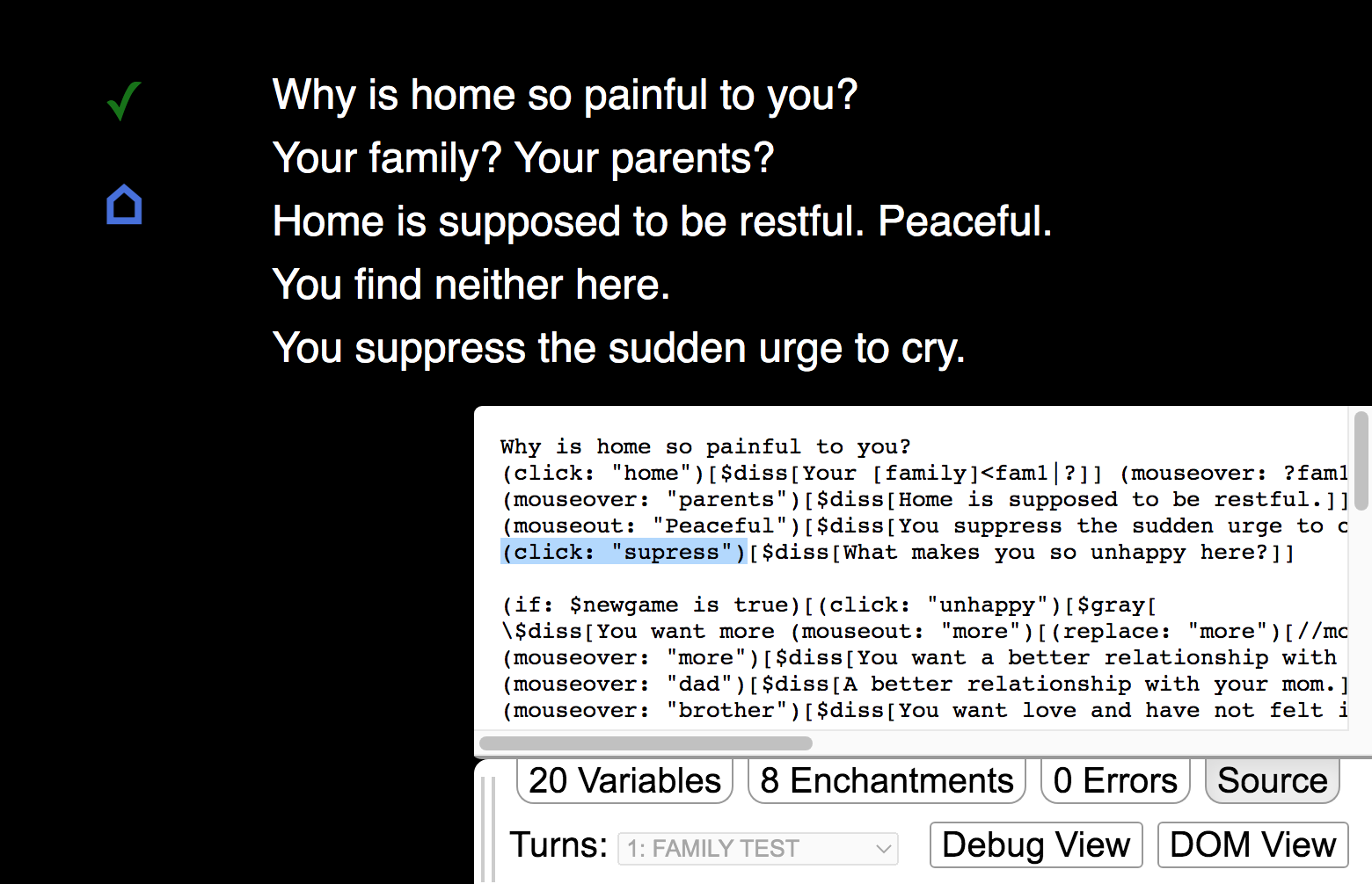
I'm proud of my usage of game elements to simulate my experience with depression. I was meticulous in designing every interaction the player used to navigate the world. Direct clicks, mouse-overs, mouse-outs, or simply the passage of time: cursor interactions defined how the piece unfolded. Choosing the appropriate text animations without going overboard was a difficult balance to strike.
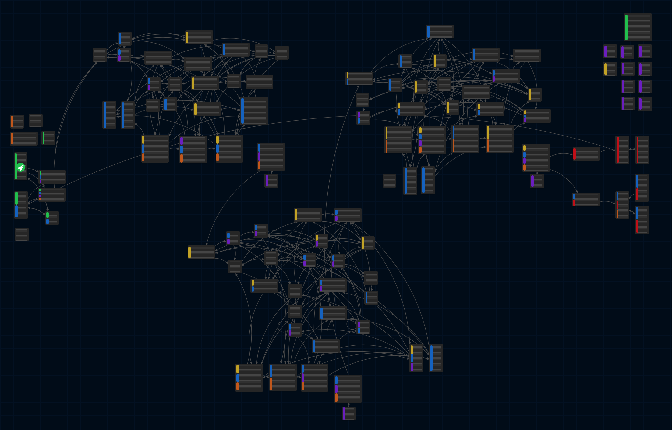
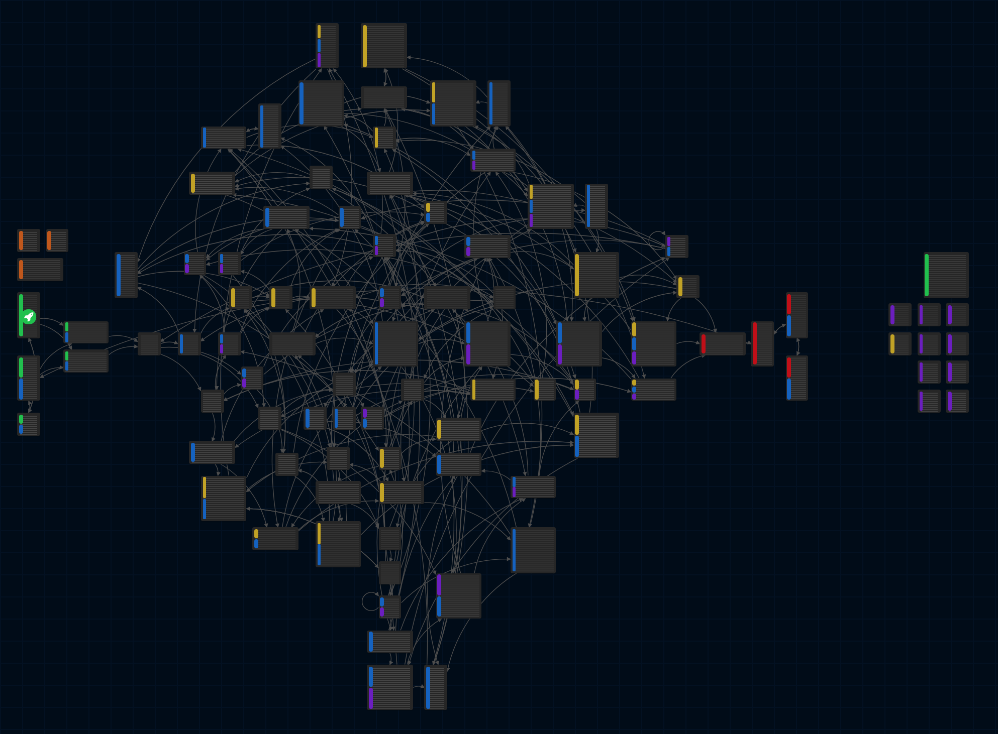
And of course, pathing out the maze was... something. Oh, the maze. The maze. The maze. It really, truly, fully mirrored the circles I'd go through mentally and emotionally. I was angry (and sad) then. I was angry (and sad) when I designed this piece. I was angry (but not as sad) when I finished it. If you were angry (and/or sad) when you played this: mission accomplished.

New Game Plus
New game plus added a much more personal layer only available after completing the piece once. One of the many reasons I love video games is that the player is required to engage to move forward. In comparison to traditional video, the viewer is still just a viewer: eventually, everything is revealed (though not necessarily processed). Here the audience had to play not once but twice to experience the "true ending." New game plus demanded even more effort from the player. Time and attention from the audience are precious - artists cannot take them for granted.
I loved exploring this new relationship between the artist and the audience. The second playthrough was an opportunity to share that extra layer of depth with more intimacy. It's a reward: you've made it this far and I entrust you with more vulnerability. On the other hand, the initial playthrough (and arguably the entire piece) may not be considered whole without this additional layer.
Making the additional content itself was also nerve-wracking because this was the first piece where I integrated my spiritual life. I don't feel this way anymore: my other project Lion Messenger directly tackled my relationship with God. I definitely felt anxious when I first released Permanent Transition though. It's a big part of why I only included this nuanced layer in new game plus. This piece let me test the water to comfortably create and share more. I should feel free to make work about whatever I want.
The Power of Social MediaTM
Honestly, I didn't expect this tiny little piece to reach so far across the world and into the depths of the internet. I only shared it a handful of times across all my socials. My circles shared this piece within their circles. It was even found and loved by many I didn't know! I never would have guessed my piece would be played in so many different countries. After taking a major step back from social media, I've come to enjoy parts of it again as it has changed and evolved. The conversations I've had with people have been extremely fulfilling and humbling. Social media remains a powerful tool for connection and community.

What Went Wrong:
Not-So-Controlled Chaos, the Maze Runner Edition
Moving through the maze is still a little chaotic. I understand that has pushed some players away; I accepted that loss even before I released Permanent Transition. The maze is supposed to be difficult, repetitive, and frustrating to navigate. After all, that's exactly how I felt over the past few years. I've considered making it easier, but that would betray my original vision! I did add chapter selection for those who completed new game plus, which was not part of my original plan. I'm sure there are other ways I could have eased the frustration without compromising my intentions.
Do Not Pass Go and Do Not Collect $200
Figuring out save progress was a huge headache for me. I know that itch.io utilizes the cache to act as your save for Twine-developed games, but I still had a lot of concerns (many out of my control). What if the user doesn't enable cookies? What if they're not playing in a normal browser? How do I ensure a seamless play experience? This piece demands a significant amount of time compared to my other new media work. As a gamer, I know that losing your progress is demoralizing and detrimental to the experience. When I updated the game file, playthroughs were also most likely reset. Many players finished the piece in one sitting, but I'm not sure I was successful in implementing a smooth save system for anyone who picked it back up again later.
I included built-in hard saves to help, but this still relied on the browser cache. Looking back, I should have used level passwords that the player could write down (shout out life before memory cards). That would guarantee progress without relying on the cache and allow the user to move between devices.
Checkpoint, Checkmark, Checkmate
After sorting out all the passages into three "chapters," I used the most important passages as required checkpoints. Not only did this force some necessary linearity, but I also used these as save points upon reload. Choosing a green checkmark to indicate both a checkpoint and a save state wasn't my best decision. It made sense to me at the time: I didn't want any extra icons to be too distracting, especially since I removed the undo and redo options in the sidebar during the first playthrough.

Compromise or Skill Issue? You Decide
It's hard translating the ideas you envision into reality. It's especially hard when you don't know the language. I have no background in coding or programming! Thankfully there are a huge number of resources out there. I was able to make things work. However, some ideas I could not work around or implement at all. My biggest regret is not tracking individual progress and exact navigation history. How cool would it have been to see your completed movement at the end? With limitless time, I'm sure I could have added many more ideas.
I also felt the limitations of Harlowe, the story format I started with in Twine, while making Permanent Transition. Twine absolutely fulfilled its purpose: it allowed non-programmers like me to create interactive text games without being burdened by coding. But, by the time I wanted to incorporate other elements, Harlowe couldn't easily support them. The major groundwork was already laid; I didn't want to change it and learn another new language. Besides, limitations enable creativity. In the future, I will just add new tools to the toolbox. Extensive knowledge of your medium (in this case: HTML, Javascript, CSS, etc.) will always give you more creative control.
Mobile Gamer Only BTW
Permanent Transition wasn't designed for mobile. I made sure to include this disclaimer, but I didn't stop players from trying either. Both the audience and art accessibility are important to me. Who am I to fight against the technology most easily accessible in our lives? Most people came upon this piece through social media, so there's a high chance they played on their phones. As the creator, I knew the mobile experience was non-ideal. Additionally, there was no way to move progress directly between different browsers, mobile or desktop.
The piece was made with the cursor in mind (another intentional parallel to my own mindless escapism on the computer). Some cursor and text interactions can't be emulated on the phone (e.g., mouse hover over and mouse hover out). I know it's out of my control. I know the piece may still be moving to the viewer. There is a unique experience to "touch" your way through the art instead. Still, I can't help but lament players missing some of the details I painstakingly designed.
Things I've Learned:
Have You Tried Turning it On and Off?
Debugging and constant playtesting are your best friends. Seriously. I spent countless hours testing interactions and animations for each individual passage. Should the player wait 5 or 30 seconds for this animation? Oh, I think this passage is connected to too many others - let me reroute the traffic and test this loop again. Where am I missing this damn closing bracket? The constant problem-solving was challenging but rewarding. This holds true even outside of coding contexts; artists are always making, editing, and re-editing their work until their idea is fully fleshed out.
Similarly, your eyes can only catch so much after being immersed in any project. Those who initially playtested for me revealed things I would not have noticed as the creator. Constructive criticism is invaluable for any undertaking. This is especially true in the art world. We make our best work (and be our best selves) with the help of others.
Funny story: as far as I know, there was only one typo that made it to the live game. Once I was told about it, I fixed it in the text and updated the file. Shortly afterward, someone else informed me the game was stuck and that they couldn't move forward! Turns out, the typo I corrected was a keyword and I didn't fix it in both places. Whoops!

Trusting the Entire Process
I don't remember how I stumbled upon Twine years ago, but I kept coming back to this unique tool. I would always start stories and never finish them. Eventually, I grew tired of the cycles of depression in my life and committed to making work about it so I could process my emotions. I had long thought that I'd have to wait until grad school to make an "art game," but I could not think of any better medium to share my experience. Thus, the messy maze that is Permanent Transition was born.
And truly, the first maze was messy. With the help of others, the beta of Permanent Transition revealed that my first network of pages was way too chaotic and random. On paper, the wild maze was conceptually sound. Each passage was simply connected to others that followed an emotional flow. Each player would have a unique nonlinear experience based on their choices. But in play, it did not carry out my vision. You could get to the ending in under 10 moves or you could loop endlessly with no guidance whatsoever. This is why I ended up dividing all the passages into three sections. It allowed me to force some linearity and help guide progression - controlled chaos if you will. I had to rework everything, but it was so worth it.
I changed very little after I officially launched the game. Not because I couldn't, but because I didn't want to change anything. I could spend forever tweaking things and adding more and more quality-of-life updates. But, this piece would consume me and all my time. I was done. I was ready to move on. The piece, with all its strengths and flaws, was finished. And that's a good thing.
All this to say: your first attempt is usually not your best. Sometimes we have to break everything down in order to build our work (and ourselves) back up and better than before. The creative process is a marathon, not a sprint. And even then, completion is better than perfection.

Games? In My New Media? It's More Likely Than You Think
I've long thought about where Permanent Transition falls on the art versus entertainment spectrum. Does this qualify as new media fine art? Or is it just another random interactive text-based game? The creation process of this piece challenged and expanded my view of the new media art umbrella. The truth is new media as an art medium continues to evolve with technology. From video and projection to VR/AR, NFTs, AI, and other cool acronyms: the possibilities become endless with how developed and ubiquitous technology is in our lives. I believe that games can (and/or already) occupy space in the new media world. It relies on the creator's vision and intention. This realization empowered me as an artist. As the creator, I get to define my work.
Permanent Transition occupies a unique space that blurs and crosses the lines between art and entertainment. I utilized game elements, game design, and game language, but my intention was never to entertain. This piece simply would not be the same without viewer participation. I say this "game" is new media art.
So, What's Next?
Ironically, this "permanent transition" is ending. The body of work that largely covers my escapism and relationship with video games is nearly complete. I have been (slowly) working on my last piece related to this chapter of my life. It will be a return to video and projection (EXCITING). I know, I know... I literally said my work would continue experimenting with interactive elements, but it just feels right. I've got two other smaller works in progress as well. A new chapter, a new journey - it feels good.
It was fun to reflect and give y'all some casual behind-the-scenes insight. I hope you all have learned a lot from this devlog! Until the next one.
- AV
Permanent Transition
Interactive text navigating the hopes and fears of those stuck in the in-between.
| Status | Released |
| Author | Angelica Verdan |
| Genre | Interactive Fiction |
| Tags | artgame, Narrative, Nonlinear, Twine |
| Languages | English |
More posts
- Last Update (Actually Maybe)Sep 22, 2021
- Last Updates (Hopefully)Sep 22, 2021
- Permanent Transition: UpdatesSep 21, 2021
- Permanent Transition: Live!Sep 13, 2021